RWD is the approach that suggests that design and development should respond to the user’s behavior and environment based on screen size, platform and orientation.
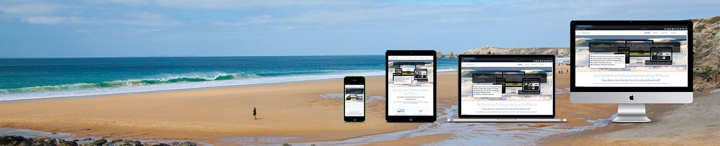
In the beginning it sufficed to concentrate all your team's efforts on the one site that was accessed solely through a desktop monitor or laptop. Slowly but surely mobile take-up increased and agencies started offering mobile and PC optimised sites. This benefited the visitor but added an unnecesary layer of complexity for the content managers. Luckily RWD is now available and essential for any business looking to optimise it's functional and viewing experience on any number of screen sizes and operating systems. The ability to manage one website to cover all of your audience is essential.
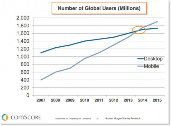
Look at nearly everyone around you and you will see them carrying a mobile device with access to the internet. At any time they have the ability to research, compare and shop. Make sure it's your website they can view and navigate at ease and don't rule yourself out from the outset.
Increasingly each member of your audience acceses your website through a variety of devices. They could research whilst on the bus using their smartphone, compare the options on their desktop at work and complete the process by purchasing on a tablet later that evening. The website has to work hard and provide the same experience and ease of use throughout.
In December of 2014, Google announced that they would be giving preferential treatment to “mobile-friendly” websites. If RWD was an optional plus before it would become essential now with your site being penalised in search results for not abiding by the new standard of the web.
Leave your contact details below and your enquiry and we will get back to you as soon as possible.
Register to stay up to date with our latest news and offers!
The Codeshore team ensures it stays ahead of the curve providing solutions that fully incorporate the demands of RWD. We check with Google on every site we produce. These latest requirements can be encapsulated in a quote by Google’s Javier Perez, “Let’s ditch the pinching, scrolling and aimless tapping, and welcome the new wave of mobile-friendly sites.”